Continuing our work on pedestrian falls we just published a paper in Injury Epidemiology focused on describing the clinical severity of injurious falls, distinguishing between falls that occur indoors and those that occur outdoors. While falls prevention guidelines focus on indoor falls, we show that the proportion of falls that cause severe injuries is similar for indoor and outdoor falls.
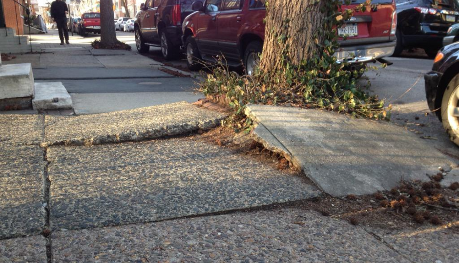
Given the large numbers of falls that occur indoors and among older persons, it is reasonable that fall prevention guidelines and research have almost exclusively focused on these indoor falls. However, given the comparable trauma severity of injurious falls that take place on streets or sidewalks to those that occur indoors and that injurious falls are expected to increase as the population grows older, we argue that greater research attention to pedestrian falls is urgently needed to inform outdoor fall prevention guidelines. Specifically, research should focus on identifying environmental, temperature, season, and built environment risk factors for injuries from pedestrian falls.
This study builds off the methodology developed in our previous work to identify injurious falls by indoor versus outdoor location using Emergency Medical Services data from the 2019 National Emergency Medical Services Information System (NEMSIS) database. Here we classified the clinical severity of injurious falls using three injury severity measures that are used in the clinical setting to help guide the care response of on-scene EMS: (1) the Revised Trauma Score for Triage (T-RTS) (2) Glascow Coma Scale (GCS) and (3) patient clinical acuity. For injured patients who fell indoors vs outdoors on streets or sidewalks, the proportions were comparable for GCS scores in the moderate or severe range, T-RTS scores indicating need for transport to a Trauma Center, and EMS acuity rated as Emergent or Critical. The proportion of severe outdoor falls on streets and sidewalks was higher among men compared to women. The severity of injurious falls on streets and sidewalks was greater for young and middle-aged adults than injurious indoor falls but this pattern was reversed for older adults.
BEH team members Katie Burford and Nicole Itzkowitz led this research.