At BEH, we’re interested in how your residential neighborhood affects how physically active you are. But we’ve come to understand that being active as not just one thing and not merely a matter of expending calories. That is, walking is different from yoga is different from basketball is different from a seven-minute workout every morning. They’re all activity, and for the most part, they’re all good for you, but two people could both meet the recommended number of minutes of activity per week, but arrive there through very different patterns of activity. We focus a lot on walking, because there’s extensive evidence that walking is one of the easiest ways to integrate activity into your daily life. As a result, we expect that making our cities more walkable could be a great way to get our population more active.
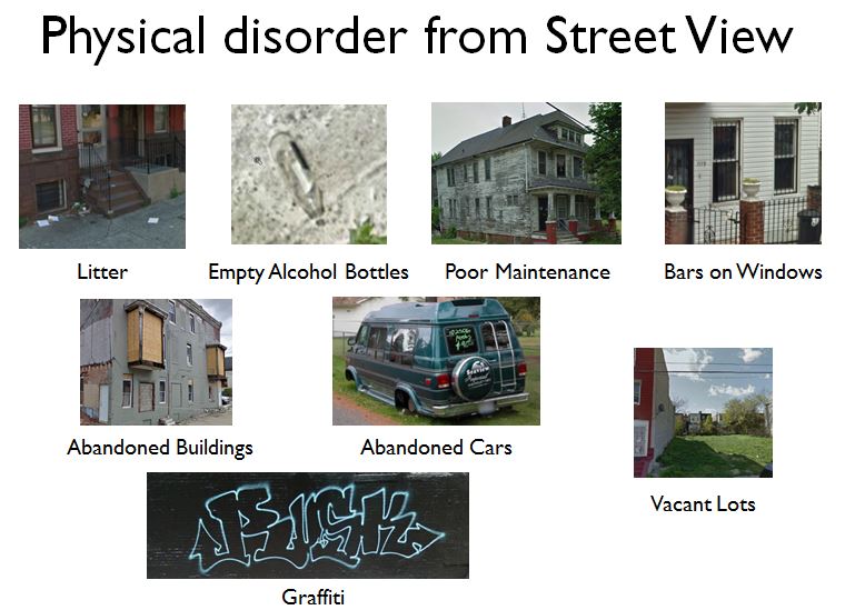
But for any given person, meeting activity recommendations may be easier for some activities than for others. Few older adults play basketball, say, but a lot of older adults say they’d like low-cost, low-impact activities, like walking and gardening. A few years ago, we started characterizing the patterns of types of activity older adults engage in, focusing on the NYCNAMES-II cohort, a cohort of older adults in New York we surveyed three times over five years. We found that adhering to specific patterns of activity predicted lower BMI better than simply analyzing total activity alone, and also explained prevalence of depressive symptoms. We also know this cohort’s neighborhood conditions (including neighborhood disorder, a conditionwe’vestudiedextensively) are correlated with their total activity and with their depressive symptoms.
So we thought we might learn something by looking at change through time in activity patterns in the NYCNAMES-II cohort, and whether those changes we correlated with neighborhood conditions. In a paper that’s just hitting the web now at the American Journal of Epidemiology, we used a latent transition analysis to explore how the activity patterns of the study participants changed through time, and then explored individual and neighborhood predictors of those changes.

Activity classes are shown in boxes, and common transitions (among those who changed classes) are indicated by arrows between boxes
We found that there were 7 common activity patterns and that the most common changes between those patterns came from adding or removing one activity type (e.g. walking, sports & exercises, etc.). Neighborhood unemployment rate was the only neighborhood level factor we found to be consistently associated with transitioning between activity patterns.
Our results were encouraging. The latent transition analysis gave us a better picture of the kinds of changes older adults in New York City make in their activity, and we learned that, for example, engaging in gardening at any given time is not just a matter of having access to gardening space and an inclination to garden. We anticipate that future latent transition analyses, with more people followed over more years could give us further insight into which activities we might suggest to which older adults to best increase population activity levels.
 So we took a look at how their measure aligned with ours, and together, we and the DNHS team recently wrote a